WE’RE NOT DESIGNING PAGES, WE’RE DESIGNING SYSTEMS OF COMPONENTS
~ STEPHEN HAY
Atomic design is a system for web development that focuses on the smallest, most common elements with clarity and precision first and then works it’s way up and out to build more complex components.
Commonalities
All websites at their core are composed of the same tags.
<html> to tell the browser this is an HTML document
<body> defines the document body
<div> a container for encapsulating elements
<section> defines sections in a document
<header> represents a container for introductory content
<footer> defines a footer for a document or section
<h1> - <h6> for headings
<p> tags for paragraphs
<a> tags for links and navigation
<img> for images
<ul>or ``<ol> for unordered lists <li> for list items
With these elements we can create almost any website. There are a slew of additional elements to make development more semantic (and we’ll use a few in an example shortly), but if you take a look under the hood of any random site - you’re gonna find these.
Let’s take a look at the pieces that make up Atomic Design and how they come together.
Atoms
As stand-alone elements, these tags are Atoms; the foundational building blocks of web development. Developing Atoms thoughtfully starts us on our path to clean, modular, scalable, and reuseable Molecules.
Molecules
Individually <label>,<input>, and <button> aren’t terribly useful, but combined they become a Molecule: snippets, or collections of code, that define and perform an action for the user.
Organisms
Place one or multiple of these <label>,<input>, and <button> Molecules inside the <form> tag and now we have an Organism: a reusable component; a pattern that we can repeat on any page of our site.
Let’s consider another Organism; imagine an article with an image and some accompanying text. We might use three Atoms to accomplish this: <img> for our picture, <h2> for our headline, and <p> for our text content. This, too, is a pattern we can see ourselves repeating throughout the site.
Templates
Now that we have a few Organisms that could be combined, we can create a Template: page-level objects that provide context to the user.
Our article, followed by our form, could be a method of engaging the user with content and then encouraging them to interact with us for more information.
Other template examples would include our site header, navigation menu, and footer.
Pages
Pages, the final frontier! As our templates move into place, they become specific instances of content. Pages are a combination of templates; for instance: our site header, navigation, the article, the form, and footer.
Organization
Embrace the Cascade
To keep our code lean and clean, we use the power of the CSS (Cascading Style Sheets) cascade to create elements that build on each other and allow for customization without bleeding out back into our base.
For any given CSS file we create, we follow this order:
Base
Base rules are the defaults. They are almost exclusively single element selectors but could include attribute selectors, pseudo-class selectors, child selectors or sibling selectors. Essentially, a base style says that wherever this element is on the page, it should look like this.[1]
Layout
Layout rules divide the page into sections. Layouts hold one or more modules together.[1]
Module
Modules are the reusable, modular parts of our design. They are the callouts, the sidebar sections, the product lists and so on.[1]
State
State rules are ways to describe how our modules or layouts will look when in a particular state. Is it hidden or expanded? Is it active or inactive? They are about describing how a module or layout looks on screens that are smaller or bigger. They are also about describing how a module might look in different views like the home page or the inside page.[1]
Theme
Finally, Theme rules are similar to state rules in that they describe how modules or layouts might look. Most sites don’t require a layer of theming but it is good to be aware of it.[1]
This organization style is know as SMACSS (Scalable, Modular Architecture for CSS)
Example Time!
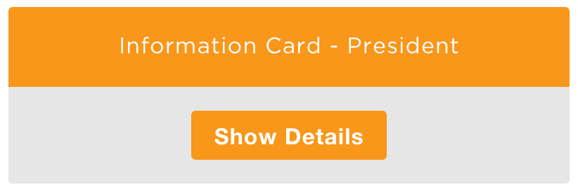
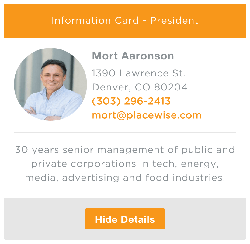
Let’s say we’ve been tasked with building a widget that is an information card of Senior Leadership Members. Our widget will have a close state and a reveal state.
Our Close State

Our Reveal State

What elements will we need to pull together to make this happen?
All common elements that do exactly what we need them to do.
<div>
<section>
<header>
<footer>
<h5>
<p>
<a>
<img>
<button>
Setup
In order for us to develop atomically and semantically the first thing we do is define a containing <div> for our component and name it aptly: ‘card-component’. All of our component’s code will be nested inside of this element. Everything that we put inside ‘card-component’ can now remain semantic and clean - any base styles we’ve written will be inherited and all we’ll need to do to style our card is build off of those existing base decisions.
This method enables us to reuse existing styles and write new code for unique components quickly without ever worrying about that code corrupting other components. Bonus points for never needing to !important again.
Note that we hardly passed any additional classes to elements inside the new component. Because we’ve already established our base styles for images and buttons and we want to write as little code as possible, we’ll use those existing classes to craft our component. We’ve avoided being duplicative AND if we decide to change how the buttons on this site look in the future, VOILA!, this component will automatically get that update.
<div class="card-component">
  <header>
    Information Card -
  </header>

  <section>
    <img class="left image-circular" src="images/.jpg">
      <address>
        <h5></h5>
        <br>
        ,  <br>
        <a class="tel" href="tel:+"></a><br>
        <a href="mailto:"></a>

       <hr>

       <p></p>
    </address>
  </section>

  <footer>
    <button class="btn btn-primary">
      Show Details
    </button>
  </footer>
</div>
With these Atoms already defined for the site that will use this component as such:
- Sass mixins and variables have been utilized; See Noel’s article “Why We Sass”
    a {
      @include margin;
      @include padding;
      background: transparent;
      vertical-align: baseline;
      font-family: inherit;
      font-weight: 700;
      color: $base-link-color;
      text-decoration: $text-decoration;
      cursor: pointer;
    }

    p,
    h1,
    h2,
    h3,
    h4,
    h5,
    h6,
    ul,
    ol,
    dl,
    blockquote {
      clear: inherit;
      margin-bottom: $base-spacing / 3;
      vertical-align: middle;
    }

    p,
    .p {
      font-family: $base-font-family;
      word-wrap: break-word;

      &:only-child {
        @include margin;
      }
    }

    address {
      font-style: normal;
    }

    img {
      display: inherit;
      height: auto;
      border: 0;
      // style the alt text
      font-style: italics;
      color: $color-primary-red;

      &:after {
        content: " (image)";
      }

      &.left {
        margin-right: $base-spacing / 2;
      }

      &.right {
        margin-left: $base-spacing / 2;
      }
    }
And the use of a few helpers:
.image-circular,
%image-circular {
  @include border-radius(50%);
}

.left {
  float: left;
  left: 0;
}
We’ll write some Sass for our new card component:
.card-component {
  position: relative;
<<<<<<< HEAD

display: inline-block;
=======
  display: inline-block;

>>>>>>> eac0ee0399a3fc61db5d82d0697ca7d48a2ae834
  width: 100%;
  border-radius: $base-border-radius;

  header {
    @include padding($base-spacing);
    border: 1px solid $color-primary-orange;
    border-radius: $base-border-radius $base-border-radius 0 0;
    background-color: $color-primary-orange;
    color: $color-white;
    text-align: center;
  }

  section {
    display: none;
    @include margin;
    @include padding($base-spacing);
    border-left: 1px solid $color-light-grey;
    border-right: 1px solid $color-light-grey;
    background-color: $color-white;

    img {
      @include size(120px);
    }

    p {
      text-align: center;
    }
  }

  footer {
    @include padding($base-spacing);
    border: 1px solid $color-light-grey;
    border-radius: 0 0 $base-border-radius $base-border-radius;
    background-color: $color-light-grey;
    text-align: center;
  }
}
Now that we’ve built our component, we can pass data into it.
{
  'title' : 'President',
  'image' : 'mortaaronson'
   'name' : 'Mort Aaronson',
'address' : '1390 Lawrence St.',
   'city' : 'Denver',
  'state' : 'CO',
    'zip' : '80204',
  'phone' : '(303) 296-2413',
  'email' : 'mort@placewise.com',
   'info' : '30 years senior management of public and private corporations in tech, energy, media, advertising and food industries.'
}
In Conclusion
Atomic design & development is about making decisons early-on that provide both compliance and conformity to the site design - always with the ability to make changes in the most efficient way. Everything that we are building now uses this approach. With each new component and/or site we gain efficiencies and a library of scalable, reuseable, and independent components that we can quickly change from client to client.
–
Resources
[1] SMACSS (Scalable, Modular Architecture for CSS)
https://developer.mozilla.org/en-US/docs/Web/HTML/Element
http://bradfrost.com/blog/post/atomic-web-design/
http://responsivedesign.is/resources/videos/atomic-design
quattromani.github.io/placewise/sandbox/card/